

Explorative data analysis is the first fundamental step of every data engineering and machine learning project. Refer to this concise summary of data analysis methods anytime, when you need a high level perspective.
This post is part of a series about the AWS Machine Learning Speciality (MLS-C01) exam. I have structured the content into eight separate posts. These posts can be consumed as a stand-alone material. If you are not preparing for the MLS-C01 exam you may still find the topics interesting:
- Part 1: The AWS Certified Machine Learning Consultant
- Part 2: The AWS Data Engineering Consultant
- Part 3: Explorative Data Analysis
- Part 4: [LINK coming soon]
AWS Machine Learning Speciality
This post covers one of the domains in the MLS-C01 exam. Domain 2. Exploratory Data Analysis:
- 2.1 Sanitize and prepare data for modeling.
- 2.2 Perform feature engineering.
- 2.3 Analyze and visualize data for machine learning.
Handling missing data
https://towardsdatascience.com/how-to-handle-missing-data-8646b18db0d4
https://scikit-learn.org/stable/modules/impute.html#impute
Drop records
- Not recommended, only for quick first insights.
- Only if 1-2% is missing
- Risk of introducing a bias, eg.: one target category is eliminated completely
Calculate missing values: statistic
- Low effort, fast calculation.
- Fairly good result, when only a few % is missing.
- Generally use mean, unless outliers are a problem, then median.
Calculate missing values: Regression
- Predicts using linear or polynomial relations .
- Good for numerical fields.
Calculate missing values: KNN
- Supervised method, value from similar rows will be used.
- Good result if the missing column is predictable.
- Not good for categorical fields.
Calculate missing values: Neural Network
- High effort.
- Good result if the missing column is predictable.
- Good for categorical fields.
Handling unbalanced data
https://towardsdatascience.com/methods-for-dealing-with-imbalanced-data-5b761be45a18
- Get more data.
- Undersample majority class.
- Oversample minority class.
- SMOTE: creating records by averaging values from existing records.
- Adjust class threshold (final model decreased False Positive, increased False Negative).
Tipp: go with “get more data” in the exam. It’s the best opting in real life as well, although it might be more laborious, than clicking one checkbox 🙂
Outliers
- Remove if use case allows it; e.g.: millionaires distorting analysis of the average income.
- Binning: equal width or frequency based (quantile) can help with identifying and scaling down outliers, if it cannot be removed.
Data distributions
Discrete distributions
https://benalexkeen.com/discrete-probability-distributions-bernoulli-binomial-poisson/
- Binomial: e.g: What is the probability of 3 tails out of 10 coin tosses?
- Bernoulli: same as binomial with only 1 trial.
- Poisson: e.g.: What is the probability of 4 goals in a Word Cup football match if the avg is 2.5?
Continuous distributions
https://www.unf.edu/~cwinton/html/cop4300/s09/class.notes/Distributions1.pdf
- Uniform: e.g.: (pseudo) random numbers from between 0 and 1
- Normal: e.g.: people’s height, weight, IQ
- Exponential: e.g.: time between customers entering a shop
Plots
https://matplotlib.org/3.2.1/tutorials/introductory/sample_plots.html
Line Plot
Visualizing continuous variables. Click for source.
Scatter Plot
Visualizing two (x and y) variables of the data. Optionally, additional variables can be introduced by color, size schemes. Click for source.
Histogram
Visualizing the approximate variable distribution. Click for source.
Box plot
Visualizing data by their quartiles with special markers for outliers. IQR is interquartile range: Q1 to Q3. Click for source.
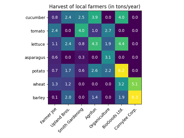
Heatmap
Visualization of a variable by two independent variables. Click for source.
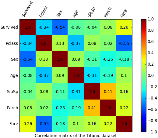
Correlation Matrix
Special type of heatmap, where columns and rows are the variables in the data set. The values are the pair-wise correlation values between the columns. Click for source.
Data Preprocessing
Raw data can be rarely fed into a model directly. Depending on the data type and the machine learning algorithms different preprocessing steps have to be executed.
https://scikit-learn.org/stable/modules/preprocessing.html
Numerical data
- Standardization: converts value range to zero mean and unit variance (assuming Gaussian data).
- Normalization / MinMaxScaling: converts value range to be between 0 and 1.
- Quantile transform: non-linear transformation; converts values to be close to Uniform distribution.
- Power transform: non-linear transformation; converts values to be close to Gaussian distribution.
- Discretization: converts continuous values to discrete bins.
Categorical data
- Ordinal encoding: “cat1”, “cat2”, “cat3” -> 0, 1, 2
- One hot encoding: “cat1”, “cat2”, “cat3” -> 001, 010, 100.
Tip: typically one hot encoding is used.
Text data
https://en.wikipedia.org/wiki/Natural_language_processing
- Convert words to lowercase.
- Separate all punctuation from words, e.g.: “One, two, three” -> “one , two , three”.
- Use case dependent:
- Stemming, e.g.: closing -> close.
- Grammar correction, e.g.: clozing -> closing.
- Remove stop words (the, is, at …), depending on the use case. E.g, it should be removed for simple relevance based methods. It should be kept for RNN based translators.
- Convert words to vectors (embedding) such a way that similar words are represented by vectors “closer to each other”. Usually using a publicly available mapping.
- Introduce end-of-sentence token.
- Create ngrams, e.g.: 1gram/unigram: “have”, “a”, “nice”, “day”, 2gram/bigram: “have a”, “a nice”, “nice day”
Text Data Analysis
Term frequency–inverse document frequency (TF-IDF) score answers the question: how relevant is a term in a given document.
Term frequency matrix
- Rows are the sentences or documents,
- Columns are the (unique) set of (unigrams, bigrams, …) across the total corpus.
- Values are the occurrence of the ngram per sentence or document.
Inverse document frequency
- log (occurance of the ngram per corpus (max 1 per document) / size of corpus).
TD-IDF usage
- Give me the documents where “nice day” is relevant:
- For every row of the TF matrix, multiply “nice day”’s column with “nice day”’s IDF and get top X.
- How relevant “nice day” in document1:
- For the cell row: “document1” and column “nice day” multiply the value with “nice day”’s IDF. Higher the score more relevant is the word in the document.
Tip: log(1) = 0, meaning that if a ngram appears in every document then it’s not relevant.
Conclusion
In this post I have introduced the most important data analysis methods and tools that every data consultant should know. In the previous posts I have introduced the AWS Machine Learning Speciality certificate for AWS Certified Machine Learning Consultants and AWS Data Engineering services for The AWS Data Engineering Consultants. Coming up next a Machine Learning Algorithms Overview post. See you there!